Links to presidential platforms
The race is on. Although hard (I don't have tv in my apartment), I've been trying to keep myself abreast with the current election issues.
From how it looks, the presidential election will a battle against personalities, not really on platforms. It saddens me, for instance, to hear some people say they'll be voting for someone just because that candidate speaks well. We must vote based on a candidate's plans and stand on key issues because good diction can only go so far.
Here technology creates the link between the candidates and the voters. A 30-second tv exposure doesn't allow a candidate to extensively comment on, say, the Reproductive Health Bill, but a website will. This bridge is, of course, limited, because majority of our people don't have computers in their homes. But anything—no matter how small—that educates voters towards the achievement of a stronger democracy must be a good thing.
This morning I was looking at the websites of the presidential candidates. If you have nothing else to do this morning, take time to study each plan-of-action.
Meanwhile, I'll have side comments on the blog design which you can skip.
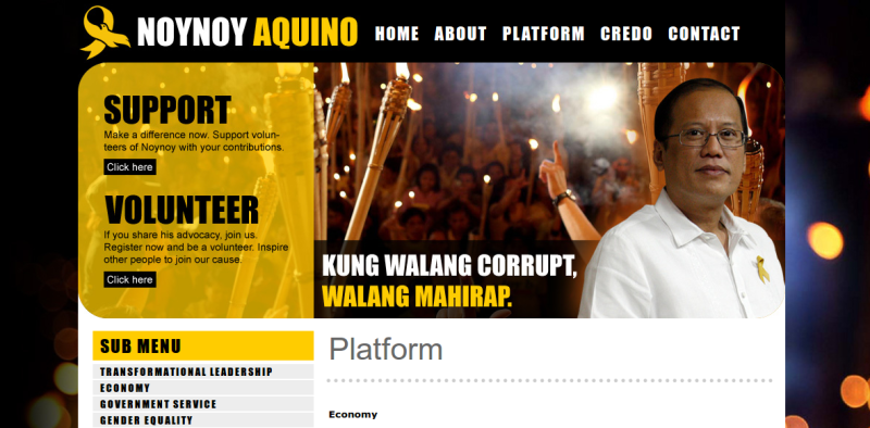
Noynoy Aquino. The best-blog design. Great font choice. Yellow and white in a black background gives the site a classic feel. Great photography, too. The bokeh in the background looks appropriate. And it's easily navigable. It loads rather quickly.


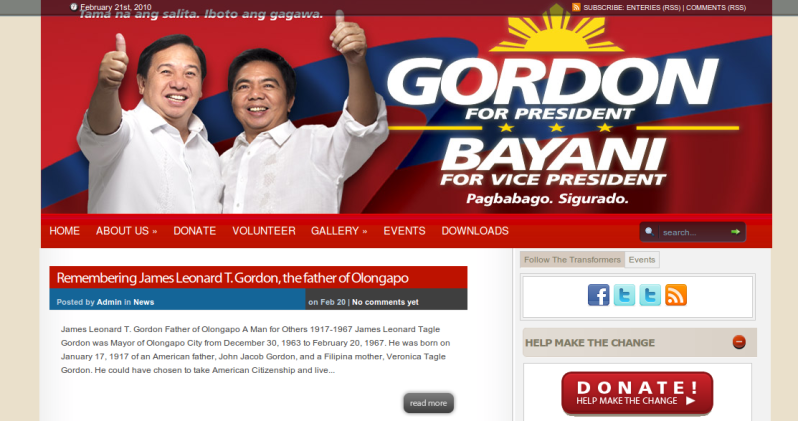
Dick Gordon. Nothing remarkable here. Content wise, it's okay. The website loads rather quickly, too.

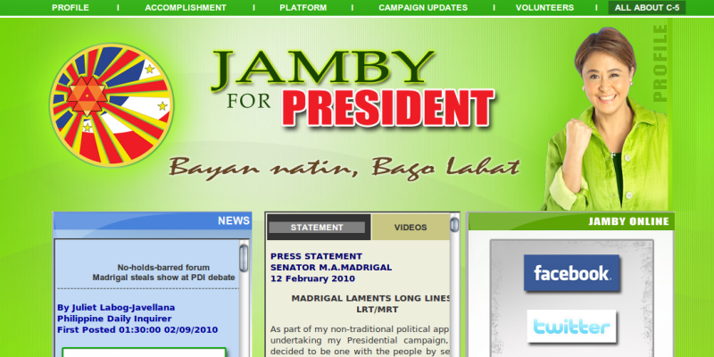
Jamby Madrigal. The font looks atrocious. The content isn't really helpful. And I can't help but wonder if a comma is needed in the statement "Bayan natin bago lahat." The colors aren't even coordinated.


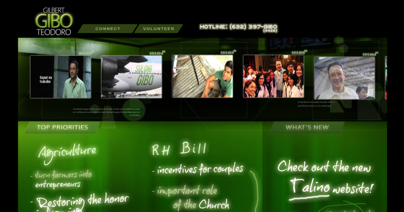
Guilbert Teodoro. This site loaded the longest, so it might not run on slow or aged computers. There are too many Java images. Simplify may be the operative word.

Manny Villar. The colors are well-coordinated. The orange looks a lot like Estrada's site. The recurring V (in the Villar name) gives the viewers a take-home message. Content-wise, it's okay.

The point really is: read their platforms, and vote wisely. Don't even mind my other comments. Great designs, after all, can only go so far.
From how it looks, the presidential election will a battle against personalities, not really on platforms. It saddens me, for instance, to hear some people say they'll be voting for someone just because that candidate speaks well. We must vote based on a candidate's plans and stand on key issues because good diction can only go so far.
Here technology creates the link between the candidates and the voters. A 30-second tv exposure doesn't allow a candidate to extensively comment on, say, the Reproductive Health Bill, but a website will. This bridge is, of course, limited, because majority of our people don't have computers in their homes. But anything—no matter how small—that educates voters towards the achievement of a stronger democracy must be a good thing.
This morning I was looking at the websites of the presidential candidates. If you have nothing else to do this morning, take time to study each plan-of-action.
Meanwhile, I'll have side comments on the blog design which you can skip.
Noynoy Aquino. The best-blog design. Great font choice. Yellow and white in a black background gives the site a classic feel. Great photography, too. The bokeh in the background looks appropriate. And it's easily navigable. It loads rather quickly.
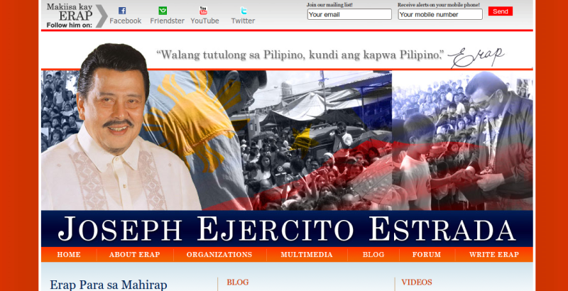
Joseph Estrada. Simple and easy to the eyes. This shade of orange looks just fine. Not assaulting at all. His signature on top gives the site a more personalized feel.
Dick Gordon. Nothing remarkable here. Content wise, it's okay. The website loads rather quickly, too.
Jamby Madrigal. The font looks atrocious. The content isn't really helpful. And I can't help but wonder if a comma is needed in the statement "Bayan natin bago lahat." The colors aren't even coordinated.
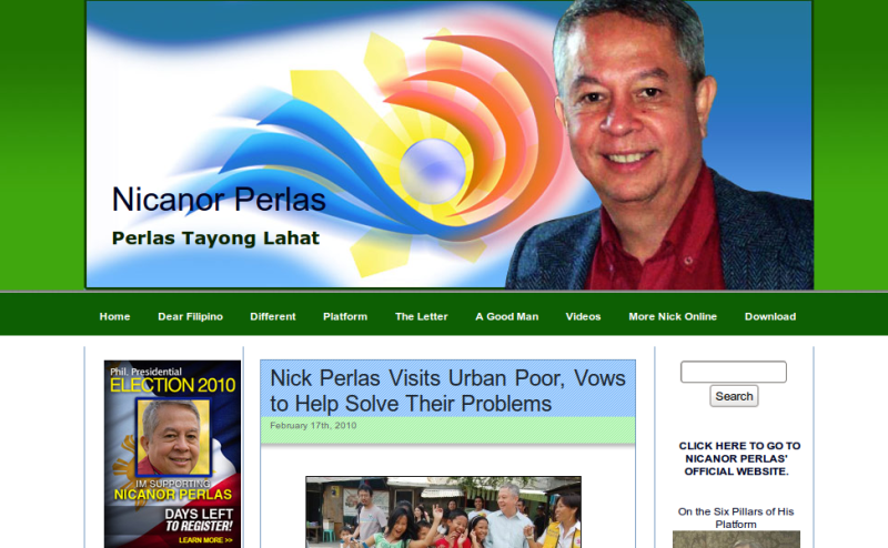
Nicanor Perlas. Nothing remarkable here. It looks like a typical blog.
JC Delos Reyes. There probably wasn't much planning in making this site. The links in the right side-bar aren't visible. Green against blue doesn't offer that much contrast.

Guilbert Teodoro. This site loaded the longest, so it might not run on slow or aged computers. There are too many Java images. Simplify may be the operative word.
Manny Villar. The colors are well-coordinated. The orange looks a lot like Estrada's site. The recurring V (in the Villar name) gives the viewers a take-home message. Content-wise, it's okay.

The point really is: read their platforms, and vote wisely. Don't even mind my other comments. Great designs, after all, can only go so far.
Hi, Lance! How do you provide links in Blogger that look like the ones in this entry? They look so organized. :)
ReplyDeleteYou mean the images, Razeru? What I do is click the insert image icon in the rich text editor, add the url of the image, then click insert. Then, on the text editor, I double click the image, and a dialog box appears with the option of where to align the image. For this entry, I "centered" all images.
ReplyDeletewalang site si bro. eddie?
ReplyDeleteI haven't seen his website yet, Jeiel. Sorry.
ReplyDeleteThanks for the info, Lance :)
ReplyDelete